What Is the Gini Coefficient?
The Gini coefficient is a statistical measure of income (or wealth) inequality within a population, expressed as a single number between 0 and 1 (sometimes shown as 0 to 100). A score of 0 represents perfect equality, where every individual or household receives exactly the same income. A score of 1 represents perfect inequality, where a single individual or household receives all the income and everyone else receives none. In practice, real economies fall somewhere in between, and the Gini coefficient is one of the most widely used single-number summaries of how unevenly income is distributed.
How the Gini Coefficient Is Calculated
The Lorenz Curve
The Gini coefficient is derived from the Lorenz curve, a graph that plots the cumulative share of total income (on the vertical axis) received by the cumulative share of the population, ranked from poorest to richest (on the horizontal axis). A perfectly equal society traces a straight 45-degree “line of equality,” where the bottom 20% of the population earns exactly 20% of income, the bottom 40% earns 40%, and so on. In any real economy, the Lorenz curve bows below that line, because lower-income groups earn a smaller cumulative share than their population share. The Gini coefficient is defined as the ratio of the area between the line of equality and the Lorenz curve (call it area A) to the total area under the line of equality (area A plus area B): G = A / (A + B).
A Simplified Worked Example
Suppose a population is divided into five equal-sized quintiles (each 20% of the population), and the income shares they actually receive are: bottom quintile 5%, second quintile 10%, third quintile 15%, fourth quintile 22%, and top quintile 48% (these five shares sum to 100% of total income). Plotting the cumulative income shares (5%, 15%, 30%, 52%, 100%) against the cumulative population shares (20%, 40%, 60%, 80%, 100%) and applying the area-ratio formula above yields a Gini coefficient of approximately 0.39 for this example distribution — a level of inequality broadly comparable to what several large, high-income economies report.

Interpreting Gini Coefficient Values
What Different Scores Mean
Because the Gini coefficient compresses an entire income distribution into one number, interpreting it requires context. In practice, national Gini coefficients (measured on disposable, post-tax-and-transfer income) typically range from roughly the mid-0.20s in the most equal economies to above 0.55 in some of the most unequal ones, with most developed economies falling somewhere in the 0.30s to low 0.40s. A lower number always means a more equal distribution of income than a higher number for the same population and income definition, but comparing across countries requires the numbers to be calculated on a consistent basis.
| Inequality Level | Typical Gini Range | Illustrative Context |
|---|---|---|
| Low inequality | 0.25 – 0.32 | Highly egalitarian, Nordic-style economies |
| Moderate inequality | 0.33 – 0.40 | Many developed, Western European-style economies |
| Elevated inequality | 0.41 – 0.50 | Higher-inequality developed economies and some emerging markets |
| High inequality | Above 0.50 | Highly unequal emerging or developing economies |
Limitations and Criticisms
The Gini coefficient is useful but incomplete. It reports the overall degree of inequality without indicating where in the distribution the inequality is concentrated — two countries can have the same Gini score with very different situations for the poorest or richest groups. It is typically calculated on income, not wealth, even though wealth inequality is usually far higher than income inequality. It is sensitive to how income is defined (pre-tax vs. post-tax, individual vs. household, before or after government transfers), so comparisons across countries or over time can be misleading if the underlying definitions differ. It also does not capture non-monetary aspects of well-being, such as access to public services, that can materially affect living standards.
Frequently Asked Questions
What is considered a “good” Gini coefficient?
There is no universally agreed “good” number, since a lower Gini coefficient simply reflects a more even income distribution, which different societies may weigh differently against other economic priorities like growth or incentives. As a rough reference point, economies in the mid-0.20s to low 0.30s are generally considered comparatively equal, while figures above roughly 0.45-0.50 are generally considered comparatively unequal.
Does a Gini coefficient of 0 mean everyone is equally rich?
No. A Gini coefficient of 0 means income is distributed with perfect equality — everyone receives the same share — but it says nothing about the absolute level of that income. A very poor country where everyone earns the same low amount would also have a Gini coefficient near 0.
How is the Gini coefficient different from a poverty rate?
A poverty rate measures the share of the population falling below a fixed income threshold, focusing only on the bottom of the distribution. The Gini coefficient instead measures the spread of the entire distribution, from the poorest to the richest, and can rise or fall even if the poverty rate stays the same, since it also reflects changes among middle- and higher-income groups.
Can the Gini coefficient go above 1?
By its standard definition using income shares that must be non-negative, the Gini coefficient is bounded between 0 and 1 (or 0 to 100 on the alternate scale). In practice, some specialized wealth-inequality calculations can technically produce values outside this range when net wealth is negative for some households, but for standard income-based Gini coefficients, the 0-to-1 range holds.
Key Takeaways
The Gini coefficient condenses an entire income (or wealth) distribution into a single number between 0 and 1, derived geometrically from the Lorenz curve, where 0 is perfect equality and 1 is perfect inequality. It is one of the most widely cited tools for comparing inequality across countries and over time, but it should be read alongside other measures — such as poverty rates and wealth distribution — since it does not show where in the distribution inequality is concentrated or what is driving it. This article is for informational purposes only and does not constitute investment advice.

QuantPro: AI Finds the Trade Before You Do
From AI-powered chart analysis to real-time market intelligence — everything a serious investor needs, in one platform.
- Automated AI chart analysis with precision trend timing
- Bull Radar: real-time visualization of geopolitical & economic shifts
- Live market-moving news and insights, curated for you
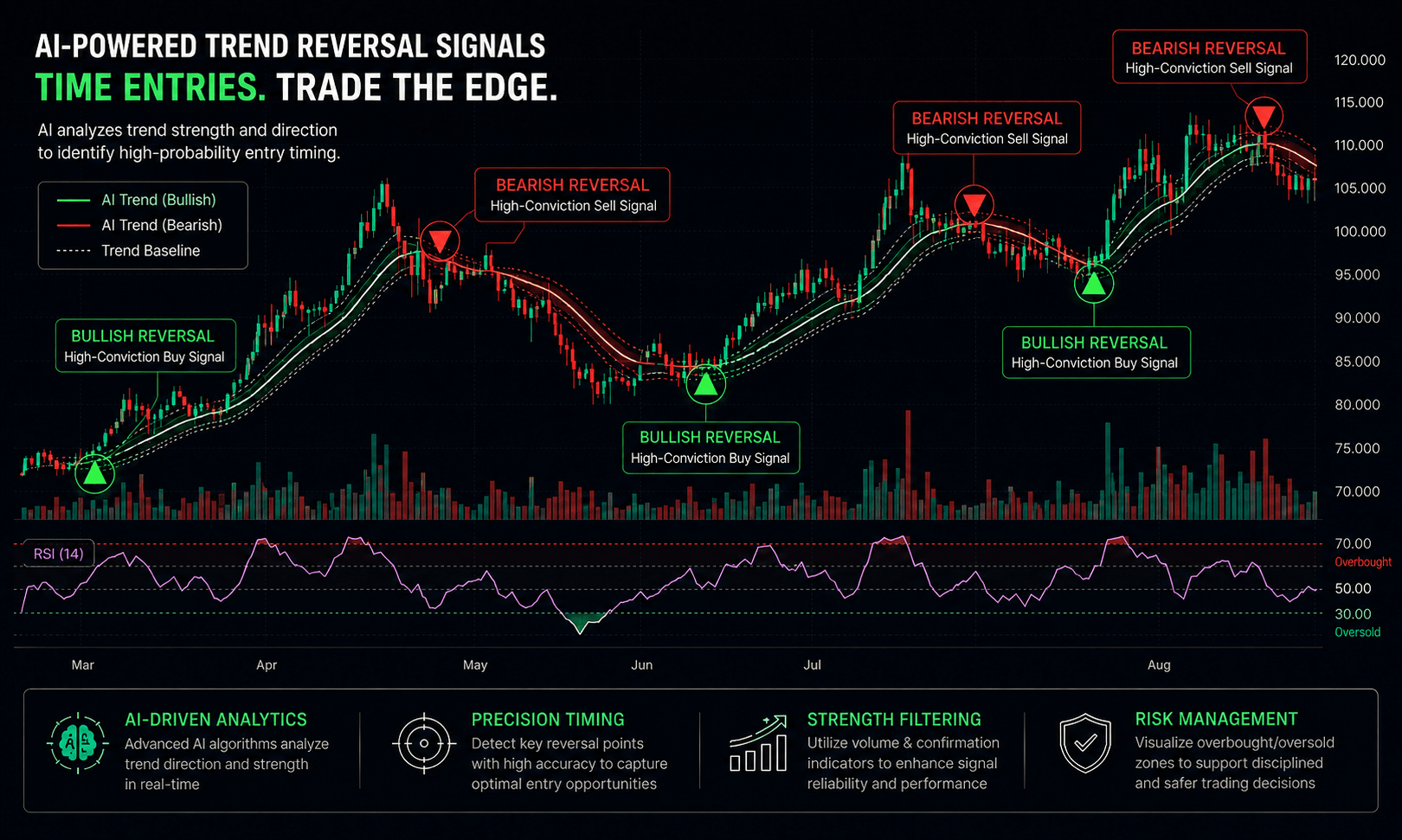
Bull Wave / Bear Wave Forecast Model
Engineered to help you read market direction and momentum faster than the crowd.
- Instantly separate bullish momentum from bearish pressure
- Pinpoint high-probability entry zones with confidence
- Chart signals clear enough for beginners, sharp enough for pros
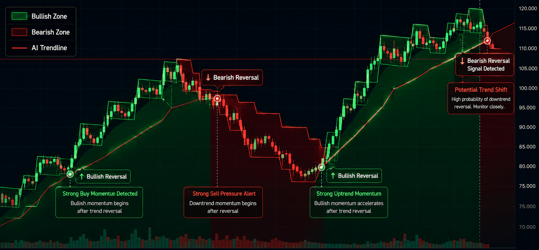
Winning Pattern Detection
Instantly surfaces the high-probability setups that repeat across the charts — a trusted edge for timing your entries and exits.
- Spot momentum building in real time
- Catch trend-reversal points before they break
- Built for active traders who need results, not theory

AI Live Economic Dashboard
AI analyzes real-time market data — turning complex, global investment flows into clear insight in seconds.
- Track global stock markets in real time
- See exactly which assets are strong — and which are fading
- Watch how geopolitical events move the markets
About the Author